
La Maison
Overview
Redefining the Neighbourhood Luxury
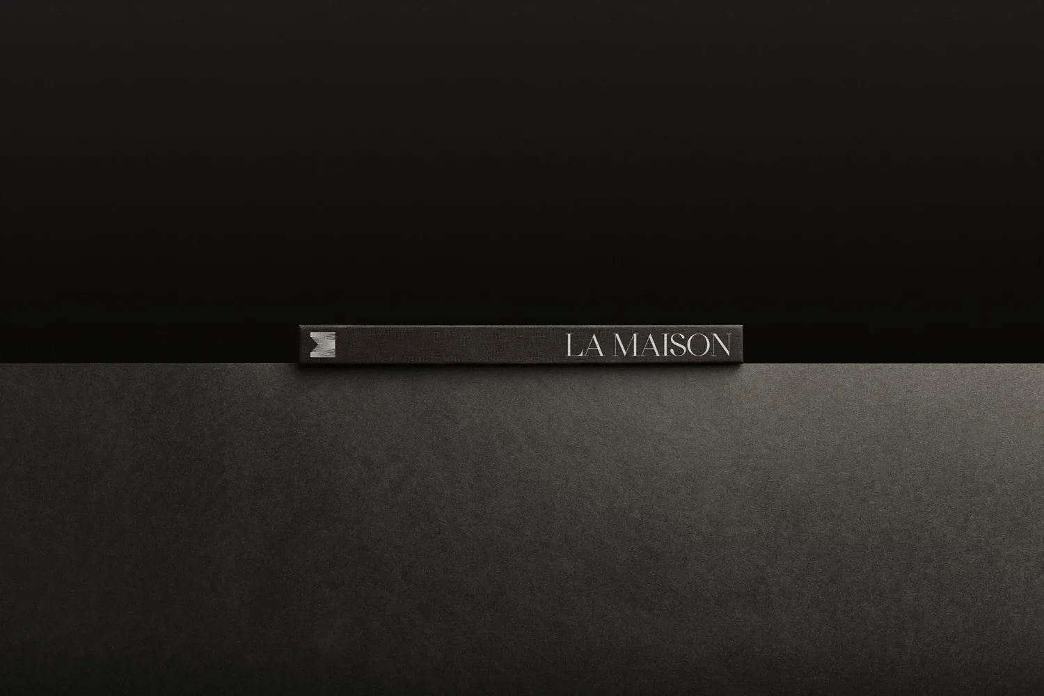
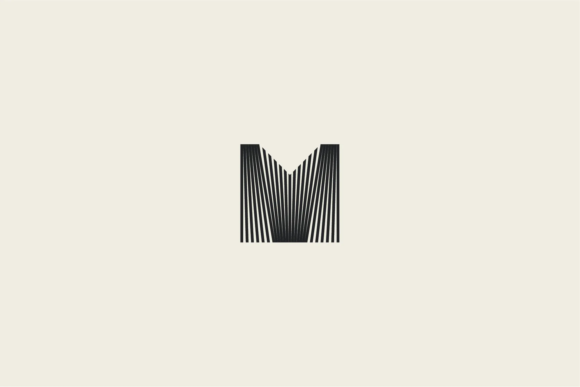
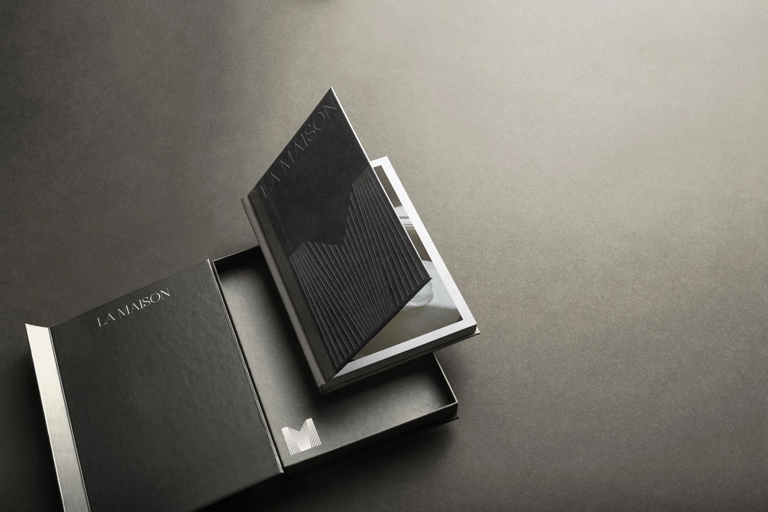
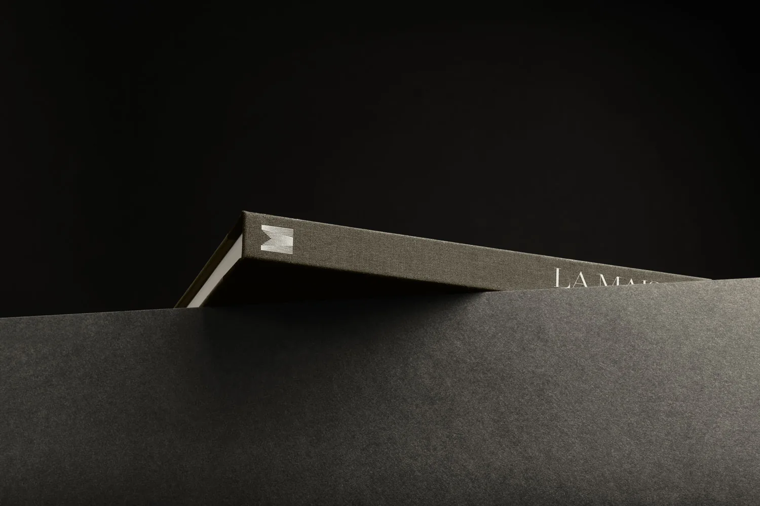
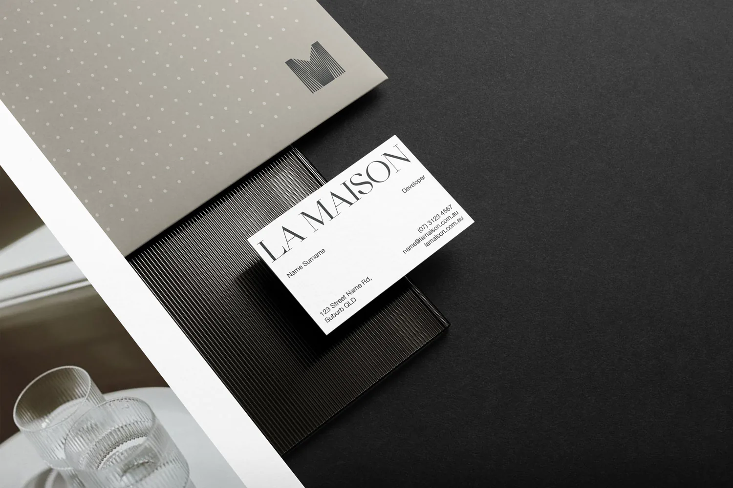
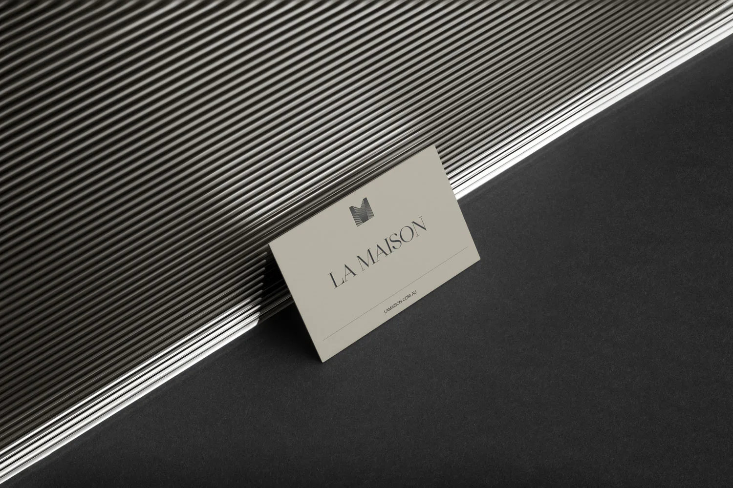
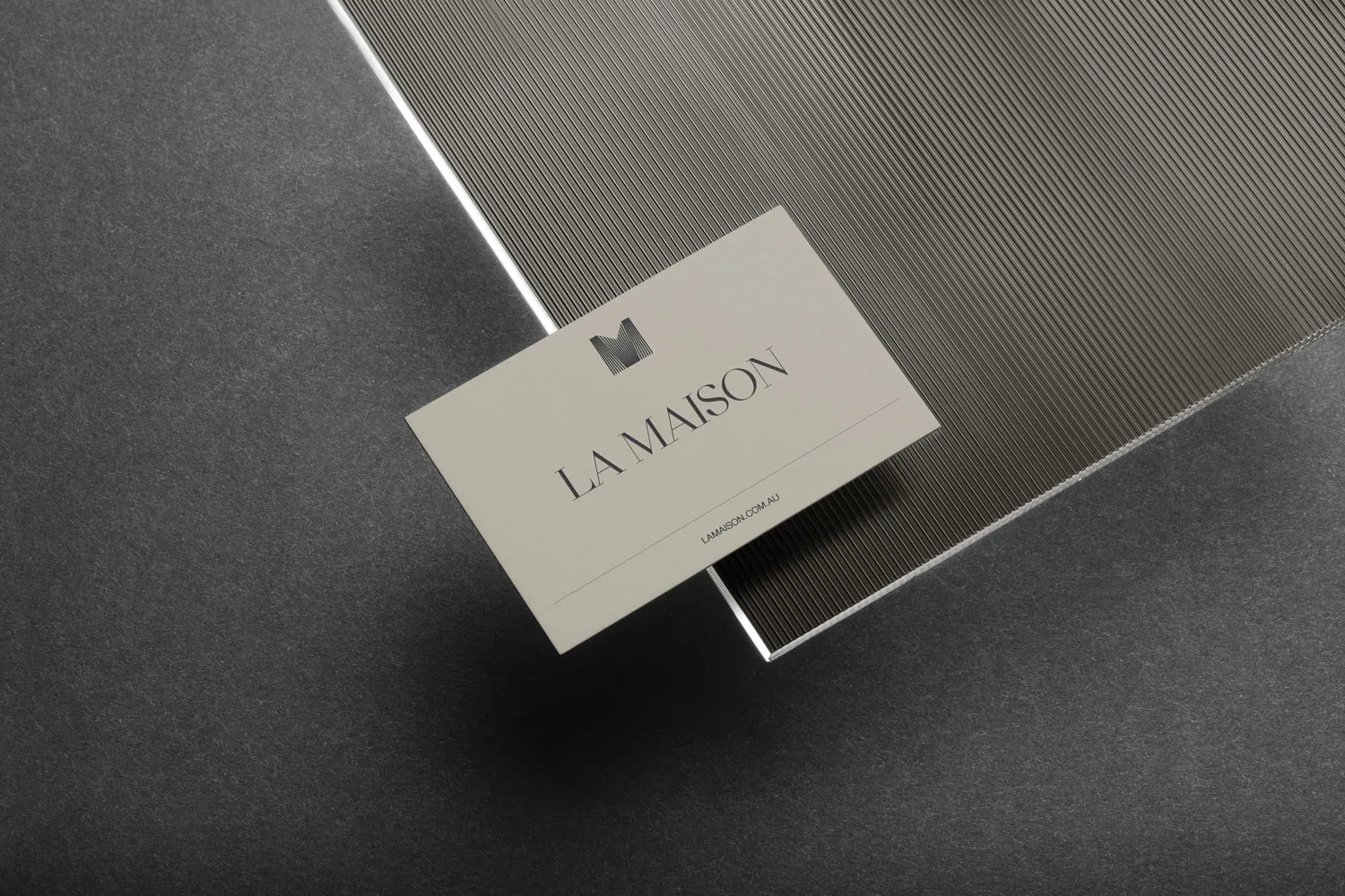
The logo was designed with a linear style to complement the property's patterned façade. This creates a brand identity that feels connected to the architecture and visually cohesive. The clean, elegant lines also reflect the brand's focus on offering modern, family-friendly luxury. Overall, the design helps keep the brand consistent, memorable, and relatable to families looking for high-quality, welcoming homes.
Approach
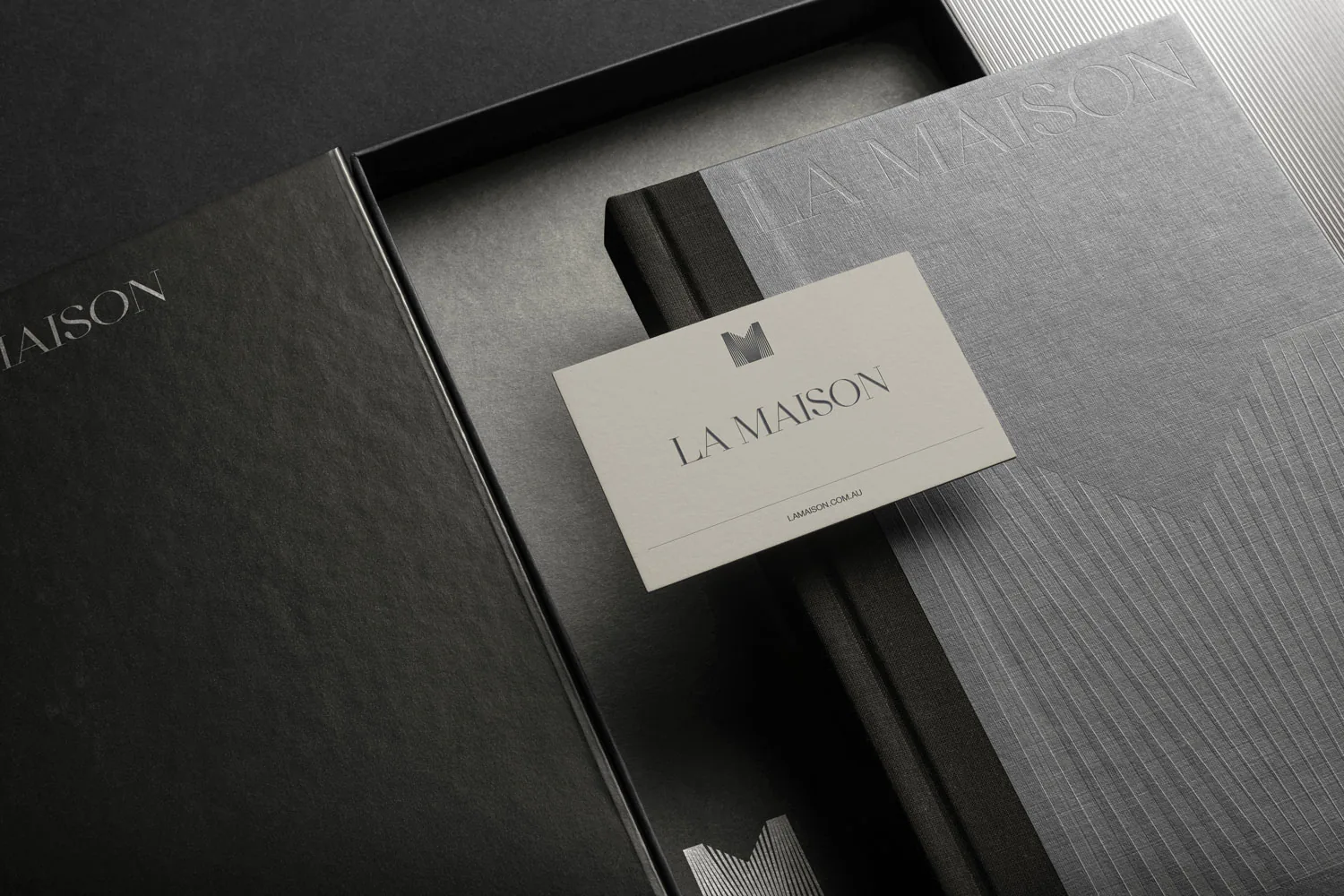
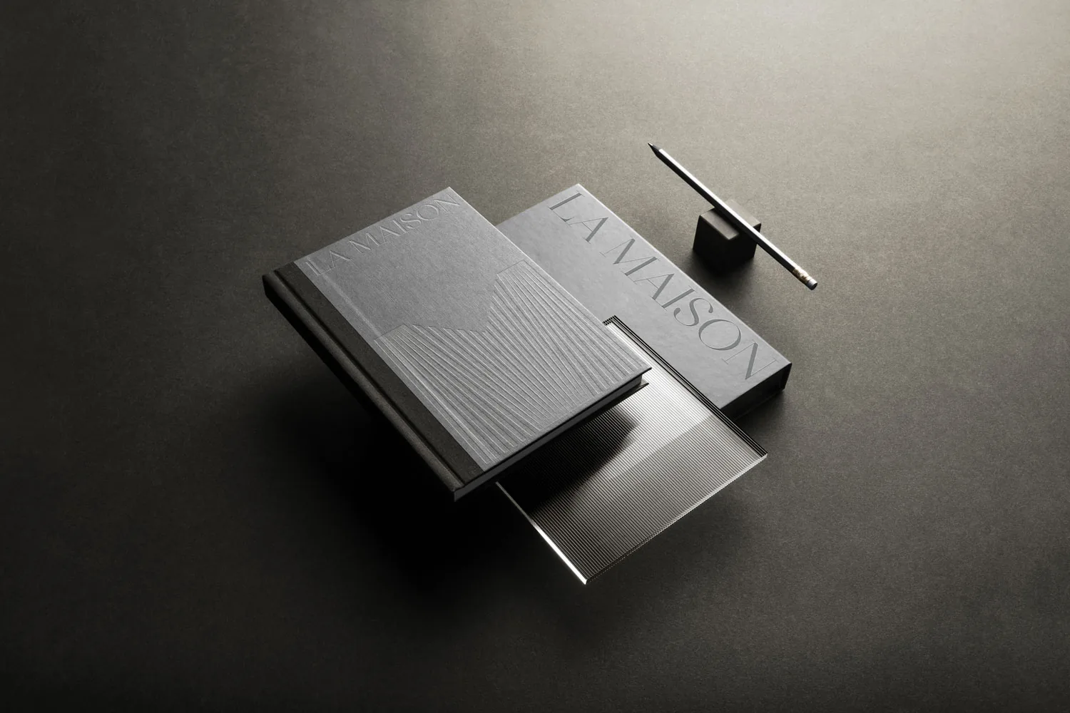
The branding for La Maison focuses on keeping the identity closely connected to the building itself. The linear logo design reflects the patterned façade, creating a clean and cohesive look. This simple, elegant style also represents La Maison's aim to offer modern, family-friendly homes. By aligning with both the architecture and the lifestyle of its buyers, the brand feels consistent, memorable, and welcoming.





Ready to make an impact?
Let's build the brand you intended.
Tell us where your business is heading. Mark will come back to you personally with how he'd approach it.
Start a project or email mark@namin.com.au